

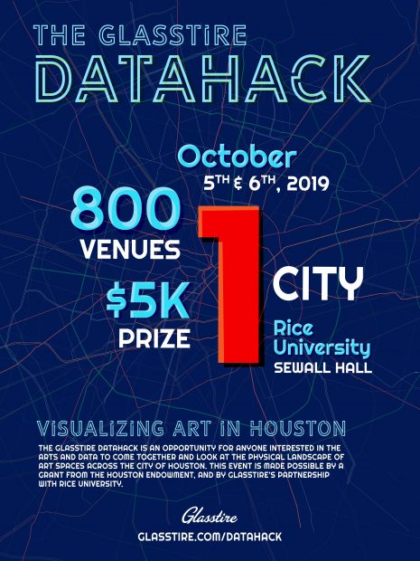
Last weekend, on October 5th and 6th, Glasstire hosted its first-ever DataHack, an event designed to provide an opportunity for people interested in the arts and data to come together and look at the landscape of art in the City of Houston.
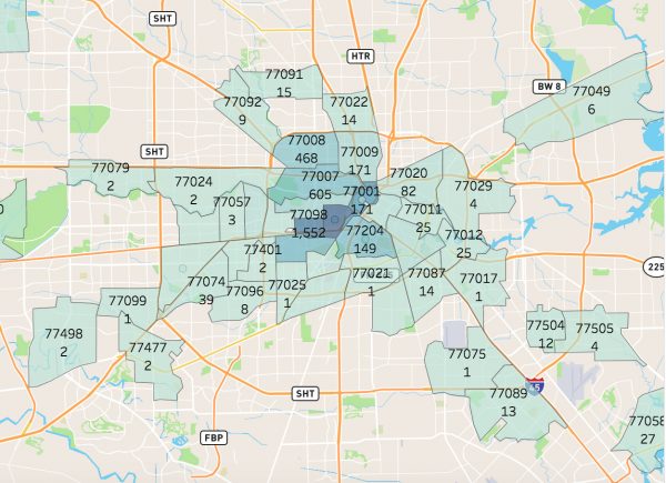
The data released to participants of the DataHack included a set of data points that Glasstire has collected since 2007, comprised of all of the Houston-area art venues and events that have ever been published in our event listings.
Though we know our data set may not offer a complete view of the arts in Houston (as our event listings are manually entered by Glasstire staff based on event submissions, email newsletters, and events that our staff finds on social media and other sources), we at Glasstire believed that the data was important to explore, as it can provided an overview of the city’s visual art community.
Over the two days of the event, individual participants and teams worked on projects that interpreted and analyzed Glasstire’s data set. One project looked at the least-used venues in the City of Houston and those venues’ proximity to local community centers, with the ultimate goal of connecting artists with community resources. Another project aimed to calculate the overall impact of art venues and their events in Houston’s various zip codes and regions.

One participant looked at the location of art events in Houston versus the location of companies hiring for science-related jobs in the city, with the conclusion that the geographic distribution of available science jobs and art venues isn’t so different. Another team, comprised of two artists, used Glasstire’s tagline “Go see some art” as a starting point, and looked for clusters of venues across the city.
Still another group went through Glasstire’s website, looking for art reviews of various venues represented in the dataset. They then compared Glasstire’s reviews to Yelp reviews and Tweets about individual venues, running all of the reviews and text through a sentiment analysis program, which is deigned to quantify the tone of a piece of writing. The group then used this analysis to compare the tones of the tweets, user-generated reviews, and Glasstire’s website.
The winning team at the DataHack, comprised of team members Huy Bui, Matthew Danielson, Pattrick Ly, and Ali Rasheed, created an accessible, interactive visualization of Glasstire’s data that broke down the number of events in the dataset by zip code, by year, by month, and by artist. You can see the winning project here.

Projects at the Glasstire DataHack were judged by a panel of three: Brian Piana, Chris Ertel, and Brian Rincon. The Glasstire DataHack was made possible by a grant from the Houston Endowment, and by Glasstire’s partnership with Rice University.
For more on the DataHack, please go here.